Wins Above Replacement (WAR) provides a point estimate of the value that a player has added in a given season. I strictly use this terminology whenever possible because this is only a point estimate gathered from the best of my imperfect ability, and because the amount of value that a player has added is not always the same as how good they are. (In some cases, the two may be vastly different.)
The Six Components
The model is built on six components:
EV Offense
Isolated impact on even strength offense
EV Defense
Isolated impact on even strength defense
PP Offense
Isolated impact on power play offense
PK Defense
Isolated impact on penalty kill defense
Penalties
Penalties taken and drawn
Shooting
Isolated shooting and goaltending impact
Note that even strength here differs slightly from the NHL's definition, and does not include plays where a net is empty; it only includes 3-on-3, 4-on-4, or 5-on-5 play where both teams have one goaltender in net.
The Process
The process for obtaining values for each of these six components can be broken down into six steps:
- Build an expected goal model. I've linked a full write-up on our Expected Goals page, but one thing to note includes an adjustment to account for scorekeeper bias.
- Estimate shooting and saving impact. Use the expected goal model to provide a point estimate of the goals that shooters have caused their teams to score and that goaltenders have caused their teams not to allow.
- Calculate play-driving impact via RAPM. Use weighted ridge regression (RAPM) to obtain a point estimate of a player's per-minute impact on offense and defense at even strength, offense on the power play, and defense on the penalty kill.
- Calculate penalty impact. Compute the rates at which the average player at each position draws and takes penalties, and then compare the rates at which each individual player does so to their positional averages. The difference is each individual player's penalty impact.
- Convert to net impact. Convert per-minute impact to net impact based on the number of minutes which a player has played. Once this step is complete, I have goals above average.
- Determine replacement level. Define replacement level and determine how many goals are worth one win; convert goals above average to wins above replacement.
Prior-Informed RAPM
As I went about developing RAPM, I spent much time reading about the NBA, where this is a much more popular and widely-accepted technique for player evaluation. I found that generally, NBA analysts preferred to use "prior-informed RAPM," which is a version of RAPM that incorporates prior knowledge of each player into the point estimate. The specific technique used for this was explained to me by Daniel Myers, developer of the NBA's Box Plus-Minus.
I tested calculating prior-informed RAPM and non-prior informed (vanilla) RAPM and found that prior-informed RAPM both provided more intuitive results and was (rather obviously) more repeatable, so I opted to go with it. In order to obtain a properly prior-informed RAPM, I used what is known as a "daisy chain," where I calculated RAPM for every single season dating back to 2007–2008 and used each subsequent value as the "prior" in next season's value. I de-weighted the priors on a year-to-year basis in such a manner that I incorporated just enough information to make it a more accurate measure of one-year impact without making it more of a multi-year measure of ability, which was not my goal.
Penalty Impact
Impact on penalties is calculated through individual penalties drawn and taken. While I believe factors outside a player's control do impact the rates at which they draw and take penalties, I'm just not convinced that regression is adept enough at properly adjusting for this external context. Similar to running a ridge regression using goals for and against as target variables, I believe this sounds great in theory, but in practice, the number of occurrences of the target variable with a player on the ice in one season is probably too low to place much stock in the outputs of such a regression.
I determined the value of one penalty minute by subtracting the league average even strength scoring rate over the last 3 seasons from the league average power play scoring rate, then subtracting the league average penalty kill scoring rate from the league average even strength scoring rate, and finally adding these two values together to determine how many goals one minute of power play ice time is worth. Teams score less frequently on the penalty kill than they do at even strength, so drawing penalties also helps a team's defense by reducing the rate at which their opponent scores (and vice versa for taking penalties), and players should therefore be credited with this. I found that the value of one penalty minute was roughly 0.11 goals.
Shooting & Saving Impact
Impact on shooting and saving is calculated through goals scored and allowed relative to expected goals. This approach allows me to break down shooting into 3 components which can then be added to other portions of the model; earlier versions of the model simply had one "shooting" component and one "saving" component, which made it difficult to truly gauge a player's impact at even strength and on the power play. This also made it impossible to gauge what a goaltender had done for each team.
Given that the sample size of goals scored in a season is quite small, I'm not currently confident using a ridge regression to isolate impact in this facet of the game; especially not after further breaking down these samples into three smaller sub-samples of even strength, power play, and shorthanded play.
Defining Replacement Level
Replacement level is defined by ice time, with a slightly different definition for each game situation:
| Situation | Forwards | Defensemen |
|---|---|---|
| Even Strength | Below 13th on team in TOI% | Below 7th on team in TOI% |
| Power Play | Below 9th on team in PP TOI% | Below 4th on team in PP TOI% |
| Penalty Kill | Below 8th on team in SH TOI% | Below 6th on team in SH TOI% |
| All Situations (Penalties) | Below 13th on team in TOI% | Below 7th on team in TOI% |
Replacement level for goaltenders is defined as all goaltenders who ranked lower than 2nd on their team in games played.
As it turned out, my replacement level player is not all that bad; they're actually a bit above average defensively, but this is more than offset by their poor offensive play-driving and horrible shooting. If I had to apply this to a real life observation, most of them just practice risk mitigation every time they're on the ice, and they're actually quite good at it. Over the course of 3 seasons, among all skaters who played at least 200 combined minutes at even strength, on the power play, and shorthanded, exactly 0 wins above replacement is 37th percentile. In other words, my best estimate is that 37% of players with a decent sample size provided contributions below replacement level.
Converting Goals to Wins
I followed Christopher Long's methodology to calculate one stable Pythagorean Exponent using every NHL season from 2007–2008 through 2020–2021: 2.022. I then used the league average goals per game scored in each season — excluding all goals scored with either net empty or in the shootout, just as I did with the rest of my model — to determine the number of goals equivalent to one win for each season.
| Season | Goals Per Win | Season | Goals Per Win |
|---|---|---|---|
| 2007–08 | 5.051 | 2014–15 | 4.908 |
| 2008–09 | 5.345 | 2015–16 | 4.853 |
| 2009–10 | 5.201 | 2016–17 | 5.053 |
| 2010–11 | 5.115 | 2017–18 | 5.375 |
| 2011–12 | 4.989 | 2018–19 | 5.438 |
| 2012–13 | 4.975 | 2019–20 | 5.422 |
| 2013–14 | 5.002 | 2020–21 | 5.285 |
Validation
A common descriptive test of a WAR model is to test the correlation between the sum of WAR at the team level and another metric like standings points or goal differential which clearly defines team quality. This test is inherently flattering to WAR because it doesn't necessarily test how well WAR evaluates skaters within a team, but just how well WAR evaluates the sum of that team's skaters as a whole.
For example, say that if we had a perfect WAR model, it would tell us that in 2018–2019, Cedric Paquette provided the Tampa Bay Lightning with -1 WAR and Nikita Kucherov provided them with 5 WAR. This would mean the aggregate of their contributions was 4 WAR. Now, say I built a terrible model which said that Paquette was worth 5 WAR and Kucherov was worth -1. The sum of their WAR would still be 4, which would perfectly match the true combined value of their contributions. But I would be horribly off on each player, and my model would have done a terrible job of actually isolating their impact. This is a made up example; nobody's model says anything close to that about Paquette or Kucherov, but it's worth keeping in mind before we begin analyzing the results of my descriptive tests.
Team-Level Descriptive Tests
Some of the outputs of my WAR model are obtained through ridge regressions. These regressions treat every player within one season as exactly one entity, regardless of whether or not they change teams during the season. This means that I can't split the contributions of players who played for multiple teams back to the teams they played for, and the best way to test the model is therefore to remove these players entirely. This is actually slightly unflattering to the model.
R² = 0.82 — The model explains 82% of the variance in standings points per 82 games from 2007–2008 through 2020–2021.
The remaining variance can be explained by some combination of wins contributed by players who played for multiple teams, pure luck, and modeling error.
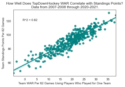
Team WAR correlation with standings points (R² = 0.82)
WAR vs. Points
The general consensus among the analytics community is that WAR and similar models are vastly superior to points. If this is true, they should do a better job of describing performance at the team level.
In order to compare the two on equal footing, I first removed all goaltenders, as nobody cares about the number of points a goaltender scores. Using only Skater WAR from 2007–2008 through 2020–2021 leads to an R² of 0.68. By comparison, skater point totals produce an R² of 0.55.
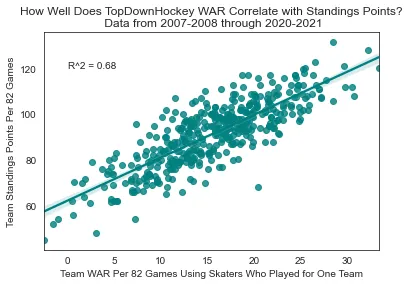
Team WAR correlation with standings points (R² = 0.68)
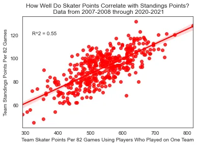
Team skater points correlation with standings points (R² = 0.55)
I have to admit, I'm impressed by how well skater point totals hold their own here. They're clearly inferior, but not by the massive margin that I'd expected. This evidence suggests that in the absence of a superior metric, there is absolutely nothing wrong with using points descriptively. With that being said, I do also think it stands to reason that while skater point totals alone do a solid job of describing success at the team level, they're probably much worse at distributing individual credit among skaters on teams than WAR is.
Predictive Testing
Perhaps a better way of determining how well these metrics properly distribute credit among teammates is to test the predictive capabilities of the model. While a model which said Cedric Paquette was the real driver of Tampa Bay's success in 2018–2019 may have passed a descriptive test for that season, it would greatly fail as soon as Paquette changed teams and was expected to bring major success to his new club at the expense of Tampa.
The methodology I chose for predictive testing remained fairly simple: Use the target metric as a rate stat in year 1 and plug that in to the amount that a player played in year 2.
Skater WAR
R² = 0.35
Year 1 WAR → Year 2 standings
Skater Points
R² = 0.23
Year 1 Points → Year 2 standings
Team Standings
R² = 0.23
Year 1 → Year 2 standings
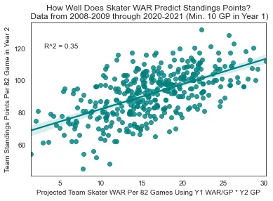
Skater WAR → Standings (R² = 0.35)
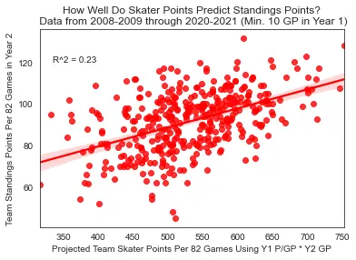
Skater Points → Standings (R² = 0.23)
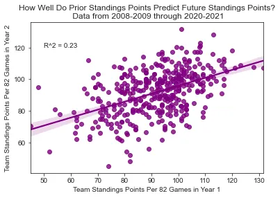
Standings → Standings (R² = 0.23)
Similar to aggregate skater points, team standings points alone do a decent job of predicting future standings points, but they don't stack up to WAR. If you want to determine who the best team is going to be in the following year and you have a good idea of how much everybody is going to play for each team, you're a lot better off using WAR than you would be if you just had last year's standings points.
Limitations
These models come with many limitations: The expected goal models can't even be classified as good on the power play, and the ridge regressions which fuel some WAR components come with a large degree of error. I also believe that at the skater level, this particular WAR model places too much emphasis on shooting and not enough on play-driving. There are two reasons for this:
- The play-driving components are obtained through ridge regression, which biases coefficients towards 0. This is necessary to avoid extreme wacky values, but it also means that the model will likely understate the true per-minute contributions that a player has on play-driving, and assume they're closer to an average player than they actually are.
- Replacement level shooting is much further below average than replacement level play-driving. My belief is that while the difference is mathematically exaggerated by the method in which the model biases coefficients towards 0 to a higher degree for players who've played fewer minutes, the difference also does exist because it's simply easier for coaches to identify and quickly cut the ice time of skaters who shoot poorly.
If I were to "weigh" each component in an entirely arbitrary manner based on what I personally think is important, the model would place less emphasis on shooting and more on play-driving. And if I were using WAR to judge an acquisition made by a team, I'd keep in mind the fact that the play-driving components are much more repeatable than shooting.
Specific Shortcomings
Just to provide one example of a shortcoming of my model, I feel that forwards who are proficient at making dangerous passes are probably underrated. Some passes lead to very dangerous shots because of factors like pre-shot movement that don't necessarily show up in expected goal models, and players who consistently create these chances will see their isolated impact on expected goals underrated. On the flip side, strong shoot-first play drivers who create chances for themselves but rarely create dangerous passing plays for their teammates will probably be overrated.
An example in practice here would be Nathan MacKinnon and Auston Matthews. MacKinnon is a great passer who is probably a bit better than the model suggests, and Matthews is a solid-but-not-elite passer who is probably a bit worse. On the flip side, the shooting impact of MacKinnon's common linemates like Mikko Rantanen will likely overrate their true proficiency, while the shooting impact of Matthews' common linemates like Zach Hyman will likely underrate their true shooting impact.
Conclusion
This is all by way of saying that WAR is not only an imperfect estimate of value added in the past, but that much more than WAR should be considered when projecting future performance. Put quite simply, WAR serves much better as the starting point for any discussion than it serves as an ending point.
While the model does a very very good job of analyzing quality on the team level, I have to admit it is probably not quite as accurate on the individual skater level. It's very difficult to isolate hockey performance, and while I did so to the best of my ability and I believe I did well, there is room for improvement. Despite building all of this, there are plenty of conclusions that may be drawn from my own WAR models that I would ultimately disagree with once I incorporate my subjective opinions.
There is plenty of other room for context as well — this metric is not meant to serve as a be-all end-all, but rather a starting point for discussion and player evaluation. Having said that, I wouldn't be comfortable sharing it if I did not believe that it was a robust, accurate, and valuable metric that I had worked very hard on. These results do have meaning. If WAR is completely at odds with your previously held beliefs, I would say you should take a second look at those beliefs and figure out what's missing from where. It might be that something is missing from the models, but it also might not be.
With the limitations in mind, I will also state that WAR is a clear-cut upgrade on more rudimentary metrics that are still referenced more frequently. You don't have to like or use WAR, but if you cover your eyes every time you see it, or plug your ears every time you hear about it, and stick to using skater points instead, you'll be wrong a lot more often.